In IntraManager Board, you can choose between several widgets to add to your boards.
- Go to Boards
- Create new board or edit existing board
- Click Create widget
For each widget, you can customize the appearance:
- Add a title and align it to the left, center, or right
- Adjust the content and set the text size to refine the layout
- Set the widget showing to Standard, Transparent, or Highlighted
- Enable Overwrite colors, to set the colors for the background and text in your widget
- Enable Overwrite Board filters if you want the widget to use specific users or teams defined on the board.
- If you have set different users or teams under the Board settings it will be overwritten
Overview
- Image
- Icon
- Text
- The Clock
- Count down/up
- Vimeo/Youtube
- Website
- Curve/bar chart
- Speedometer
- Pie Chart
- Progress
- Word Cloud
- Number
- Table
- Performers
Image
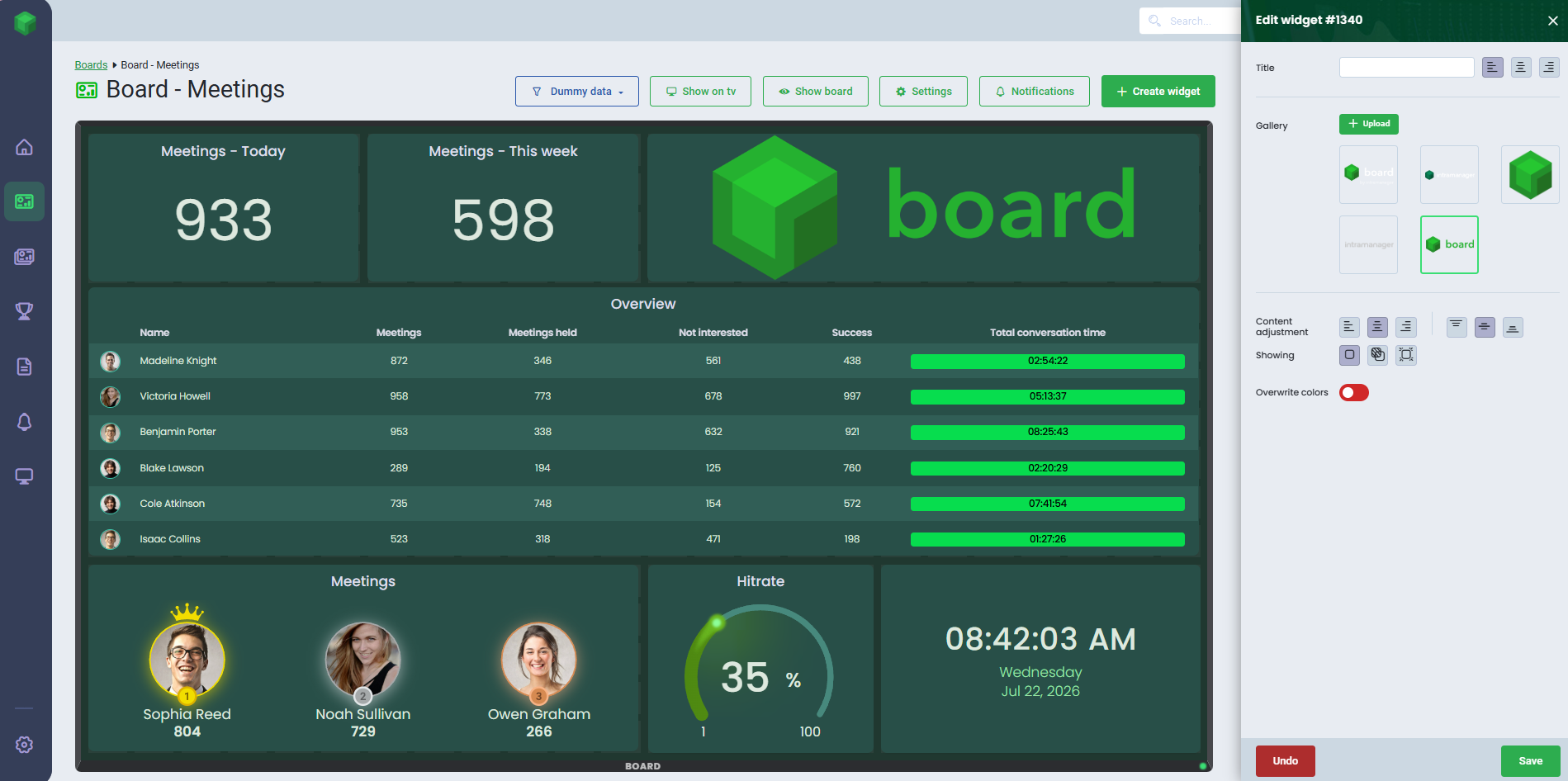
Easily differentiate your boards by adding images or GIFs.
- Select the Image widget
- Place the widget on the board
- Click Upload to add an image or GIF, or choose one from the gallery to display in your widget
- If you choose to upload an image, you can crop and rotate it
- Click Save
Please note, if you use a GIF, you won’t be able to resize or rotate it.
To delete images from your gallery:
- Navigate to Settings
- Click the Images menu
- Click delete on the image you want to delete
- Confirm with Yes
Icon
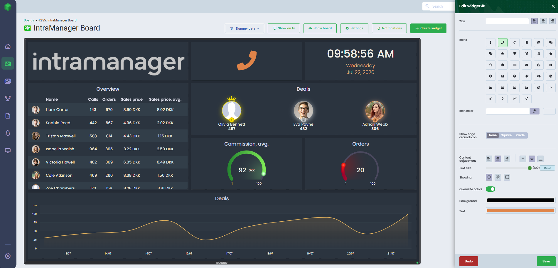
Highlight your content with icons.
- Select the Icon widget
- Place the widget on the board
- Choose the icon from the overview that you want to display. If you want to add a color to the icon or a border around it, it is easy to customize
- Click Save
You can either use predefined colors or enter a HEX code, to customize the color.
If no color is selected, a color will automatically be chosen.
Text
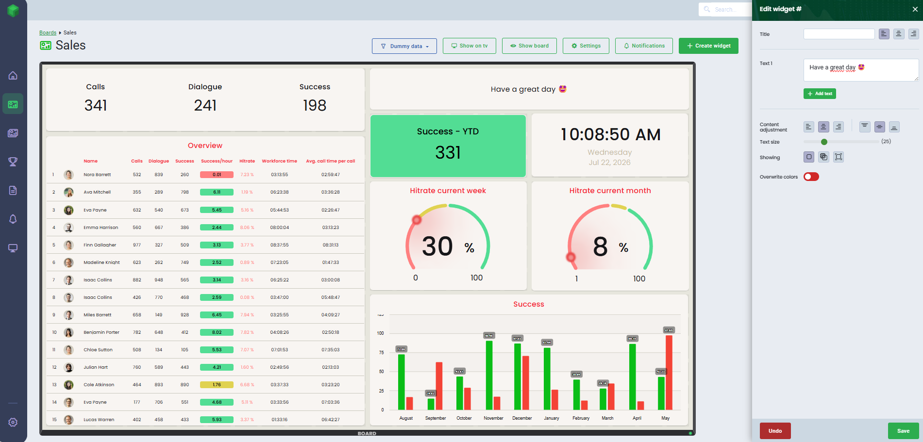
The Text widget allows you to add text to your board.
- Select the Text widget
- Place the widget on the board
- Enter your text in the Text 1 field
- Click Add text to add more text fields. You can also choose whether the texts should have the same or different headings, by using the toggle.
- Click Save
If you include multiple text fields within the same widget, the text will display alternately on the board.
The Clock
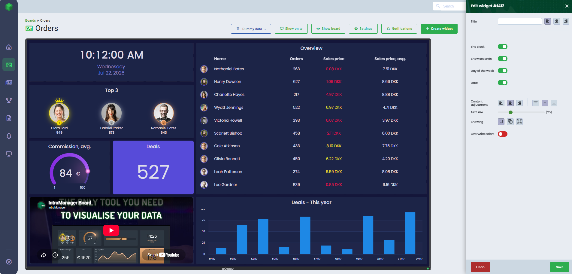
If you want to keep track of time or date, you can add a Clock widget to your board.
- Select the Clock widget
- Place the widget on the board
- Customize your clock by choosing which elements to display
- The clock, Show seconds, Day of the week and Date
- The clock, Show seconds, Day of the week and Date
- Click Save
Count down/up
With the Count down/up widget, you can count up or down to a specific date or choose a KPI that is based on a date.
- Select the Count down/up widget
- Place the widget on the board
- Choose between Fixed value or KPI
- Fixed value: Enter the specific date you want to count up from or down to
- KPI: Select Data Source and a KPI with a date you want to count up from or down to
- By default, the widget is set to Count down to. If you want to count up instead, enable the Count up toggle
- You can adjust the display to Show days, hours, minutes, seconds using the available toggles
- To display the widget vertically, enable the Vertical toggle
- Click Save

Vimeo/Youtube
With the Vimeo and YouTube widget, you can insert videos that play directly on your board.
- Select the Vimeo or Youtube widget
- Place the widget on the board
- Insert the video link
- Modify with widget by enabling Autoplay and Start without sound
- Click Save
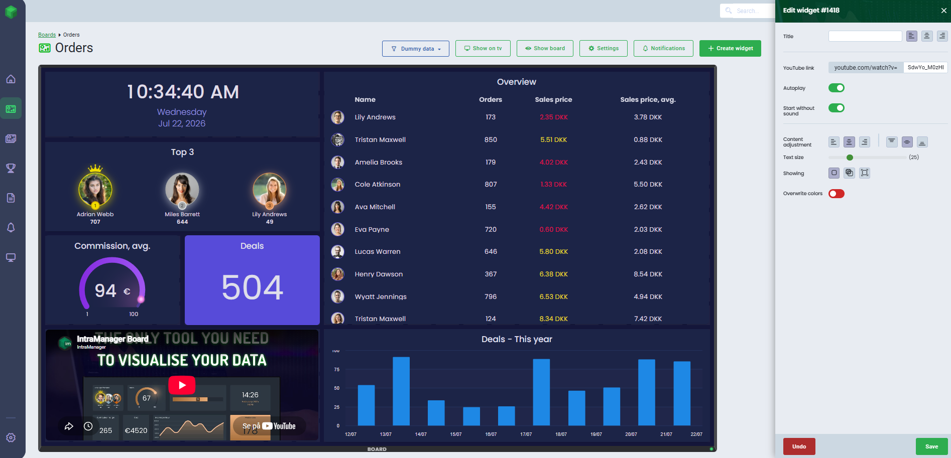
Please note that when using Vimeo, the link must be of the type review instead of
presentation.
Website
The Website widget allows you to display websites directly on your board.
- Select the Website widget
- Place the widget on the board
- Insert URL
- Click Save
In order to use the website widget, the website must allow loading through an iframe.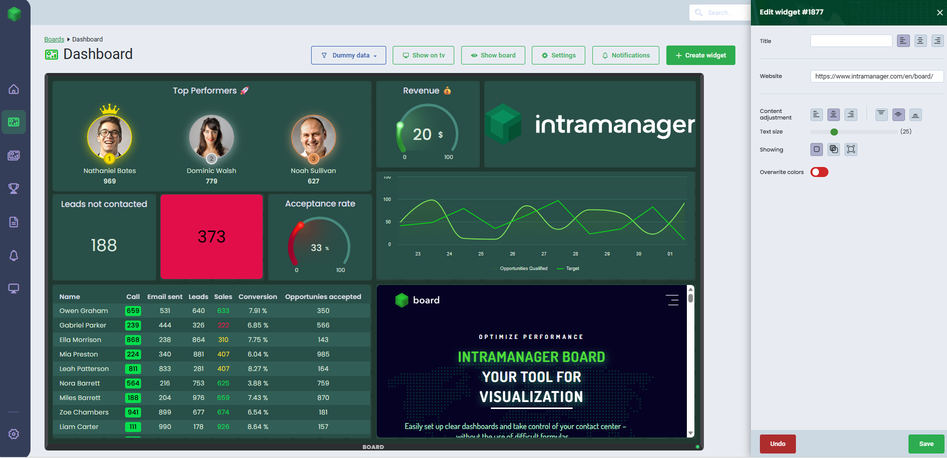
Curve/bar chart
Get an easy overview of your KPIs with the curve/bar chart widget.
- Select the Curve/bar chart widget
- Place the widget on the board
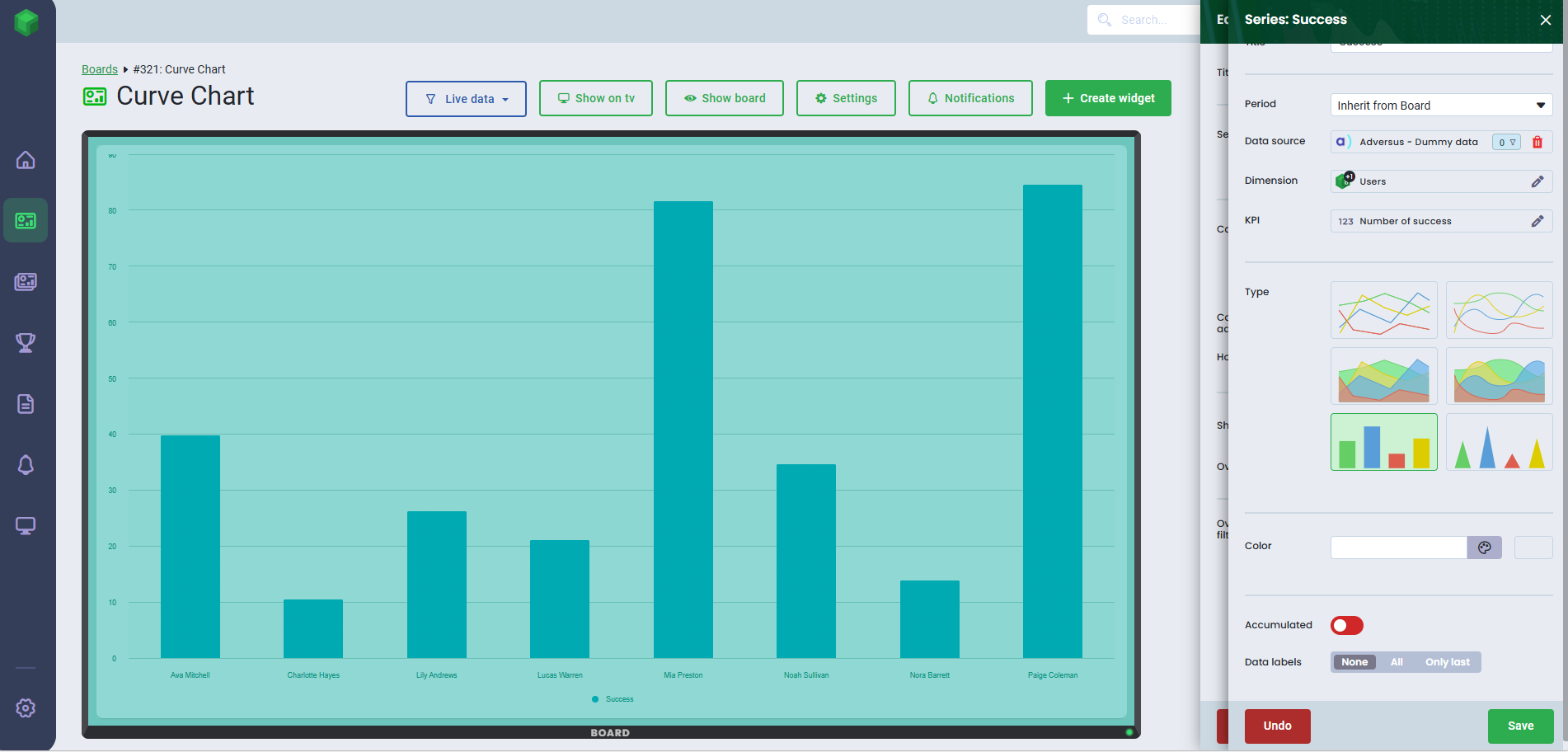
- Click Add series for each chart you want to display and give each series a title
- Select the time period for your widget.
- Leave Inherit from Board to use the board's default period, or choose another time range from the dropdown menu
- Select the data source and the dimension you want the chart to visualize. Learn more about setting up a data source here.
- Use filters if you want to display specific data
- Select Dimension
- Select the KPI
- Select the chart type
- Optionally choose a color. If no color is selected, a default will be applied.
- To display accumulative data, where data is aggregated over a given period, you can easily enable this function.
- You can add data labels to your chart and choose between All and Only last
- Click Save
- Select the time period for your widget.
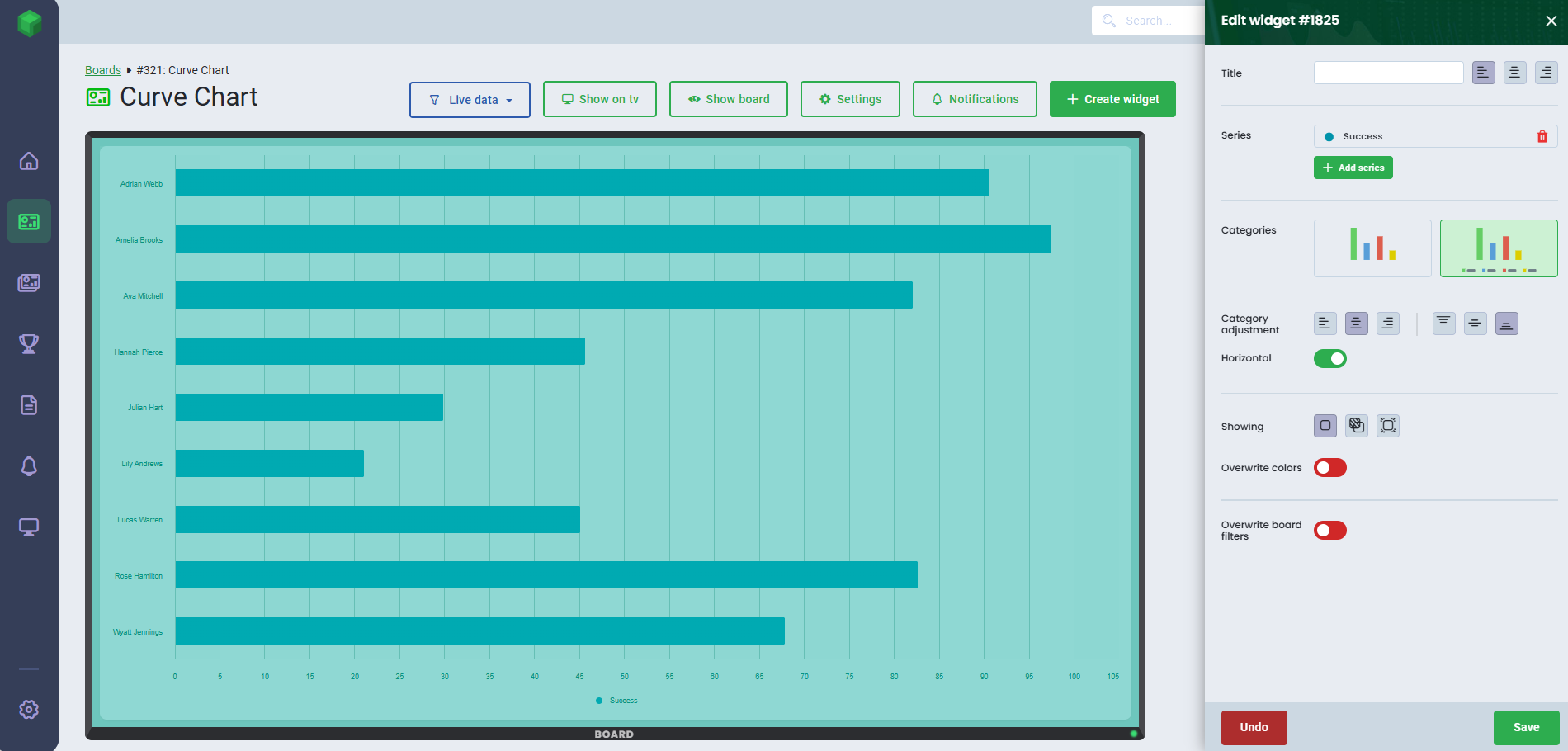
- After creating your series, adjust the widget if you want to hide categories or change the layout from vertical to horizontal
- Click Save
You can add up to 10 series per widget.If you wish to compare periods, you can for example, choose the 'Month of the year' dimension, if you want to compare months. Select the same KPI and different periods for comparison. In Dimension, you can choose from Users, Teams, Time Dimensions, and your own custom dimensions.


Speedometer
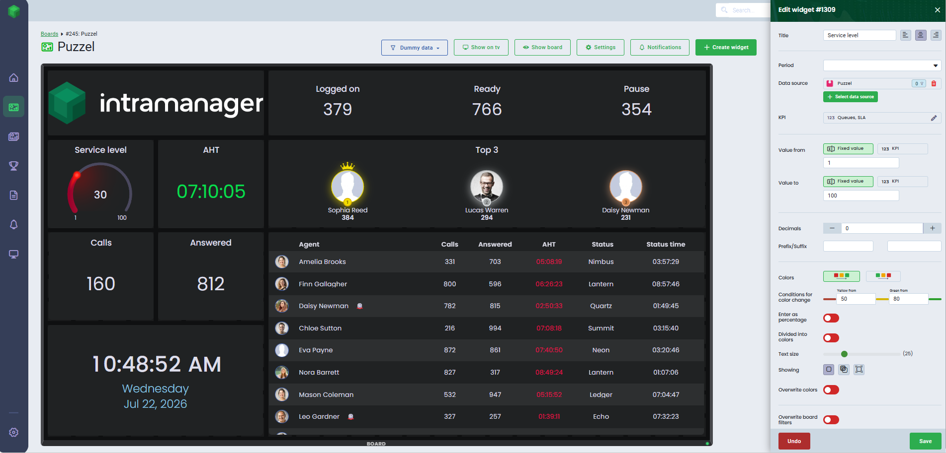
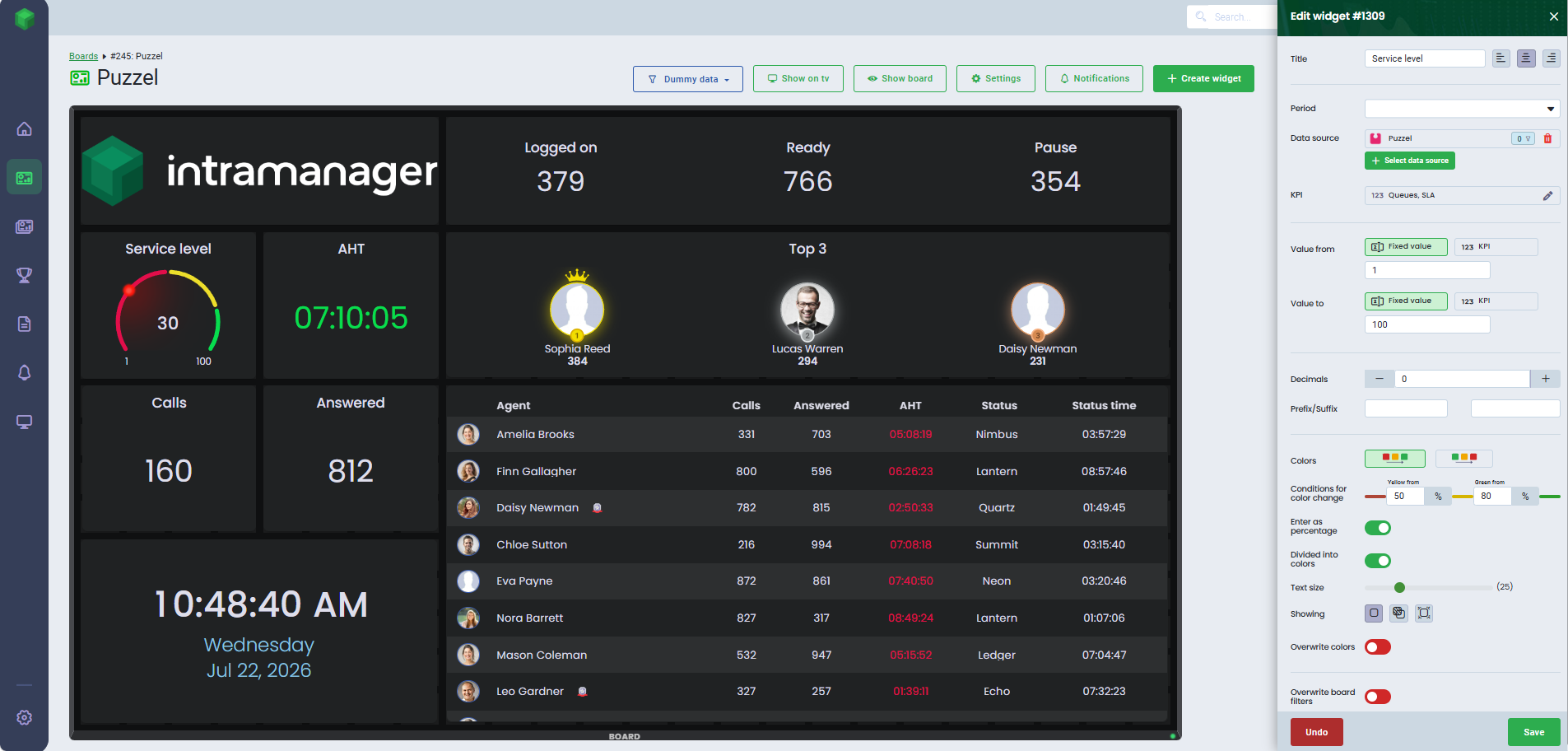
With the speedometer, you can visualize the progress of your selected KPI.
- Select the Speedometer widget
- Place the widget on the board
- Select the time period for your widget.
- Leave Inherit from Board to use the board's default period, or choose another time range from the dropdown menu
- Select the data source. Learn more about setting up a data source here.
- Use filters if you want to display specific data
- Select the KPI
- Enter a value range for your speedometer. You can choose a fixed value or assign a KPI to the speedometer.
- Customize the speedometer by adding decimals, prefixes and suffixes
- Customize the colors by adding color conditions and choose the direction in which the color should move on the speedometer.
- Enter as percentage: Enable the toggle to display the data as percentage
- Divided into colors: Enable the toggle to divide the speedometer into multiple color sections
- Click Save
Pie Chart
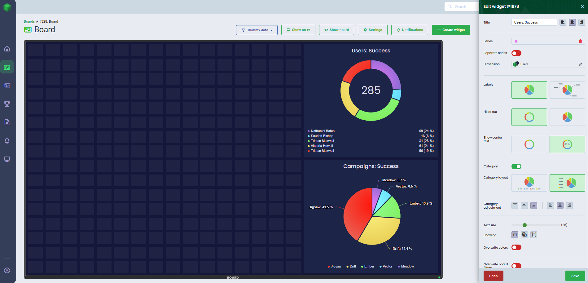
Easily display the distribution of your KPIs using the pie chart.
- Select the Pie chart widget
- Place the widget on the board
- Click Add series for each chart you want to display and give each series a title
- Select the time period for your widget.
- Leave Inherit from Board to use the board's default period, or choose another time range from the dropdown menu
- Select the data source and the dimension you want the chart to visualize. Learn more about setting up a data source here.
- Use filters if you want to display specific data
- Select the KPI
- Optionally choose a color. If no color is selected, a default will be applied.
- Click Save
- Select the time period for your widget.
- Choose to make separate series or enable Seperate series and select which dimension the pie chart should be based on.
- Customize the appearance of your pie chart by choosing whether to display labels, filled out, center text, as well as adding category vertical to horizontal
- Click Save
Progress
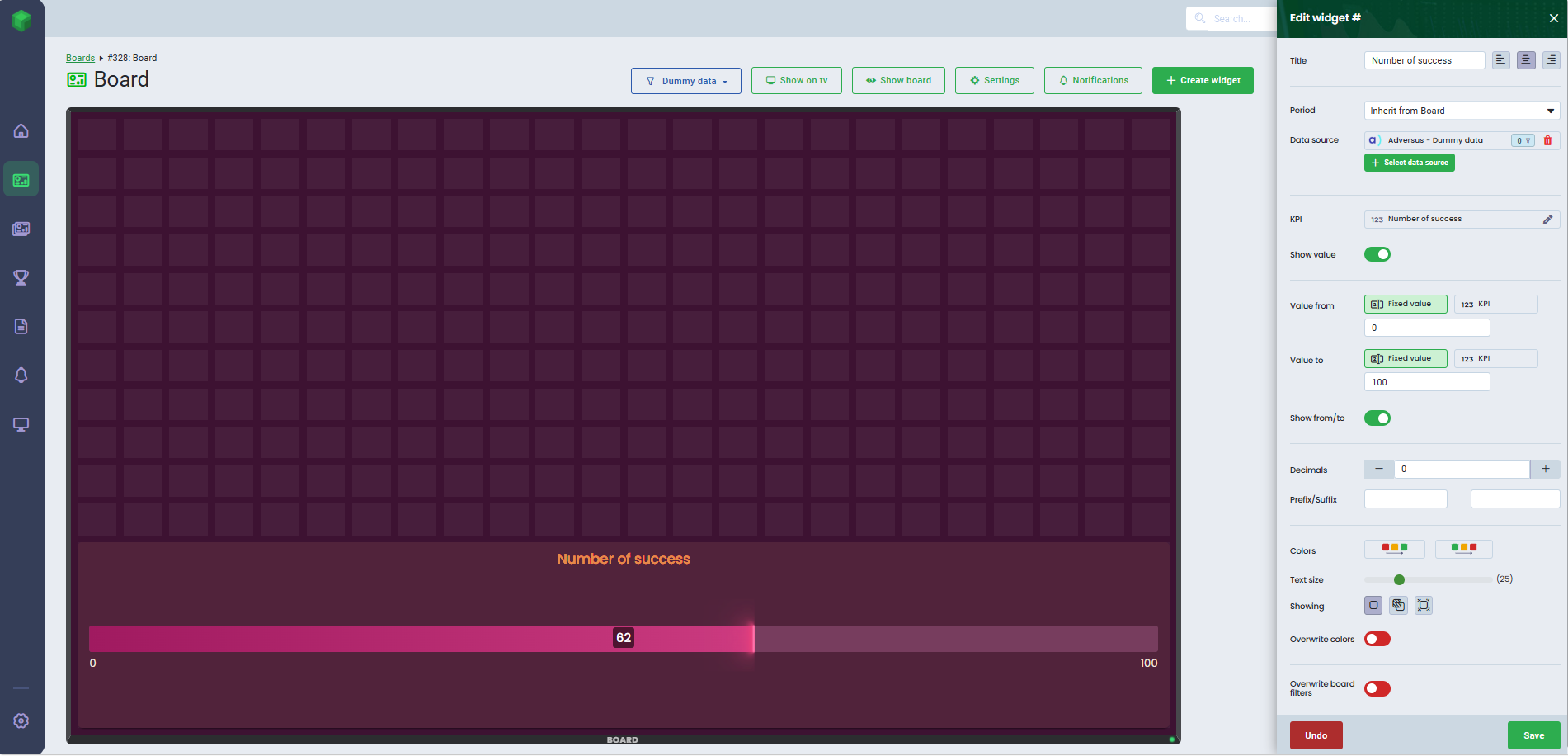
Visualize your goal progression using the Progress widget.
- Select the Progress widget
- Place the widget on the board
- Select the time period for your widget.
- Leave Inherit from Board to use the board's default period, or choose another time range from the dropdown menu
- Select the data source. Learn more about setting up a data source here.
- Use filters if you want to display specific data
- Select the KPI
- Enable Show value, if you want to have the value of the KPI displayed
- Enter a value range for your widget. You can choose a fixed value or assign a KPI to the widget.
- Enable Show from/to, if you want to display the number from previous step
- Customize the widget by adding decimals, prefixes and suffixes
- Customize the colors by adding color conditions and choose the direction in which the color should move on the widget.
- Click Save
Word Cloud
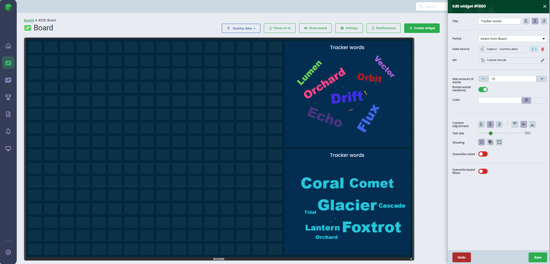
The Word Cloud widget displays the most frequently used words.
- Select the Word Cloud widget
- Place the widget on the board
- Select the time period for your widget
- Leave Inherit from Board to use the board's default period, or choose another time range from the dropdown menu
- Select the data source. Learn more about setting up a data source here.
- Use filters if you want to display specific data
- Select the KPI
- Optionally, set the max amount of words to display in your widget
- If you want the words to rotate randomly, enable this feature. If disabled, the words will appear horizontally.
- Optionally choose a color, all words will be visualized with this color. If no color is selected, default colors will be applied.
- Click Save
Note that this widget can only be used with Capturi data.
Number
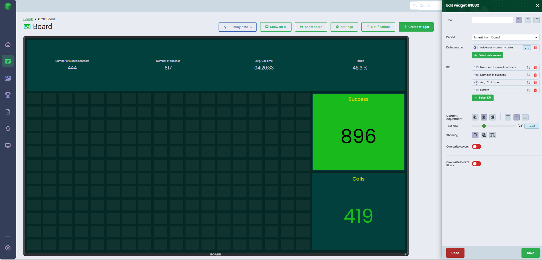
Get an overview of your numbers with the number widget.
- Select the Number widget
- Place the widget on the board
- Select the time period for your widget
- Leave Inherit from Board to use the board's default period, or choose another time range from the dropdown menu
- Select the data source. Learn more about setting up a data source here.
- Use filters if you want to display specific data
- Select the KPI/KPIs
In the number widget, you can add several KPIs in the same widget by selecting them from the list.
6. Customize each KPI by naming it, adding decimals, time formatting (for time KPIs), prefixes, and suffixes, as well as setting color conditions
7. Click Save for each KPI and finish by clicking Save on the widget
Time is displayed in seconds by default, so remember to adjust how you want the time to be displayed in your widget.
Watch this video for more information on how to set up number widgets.
Table
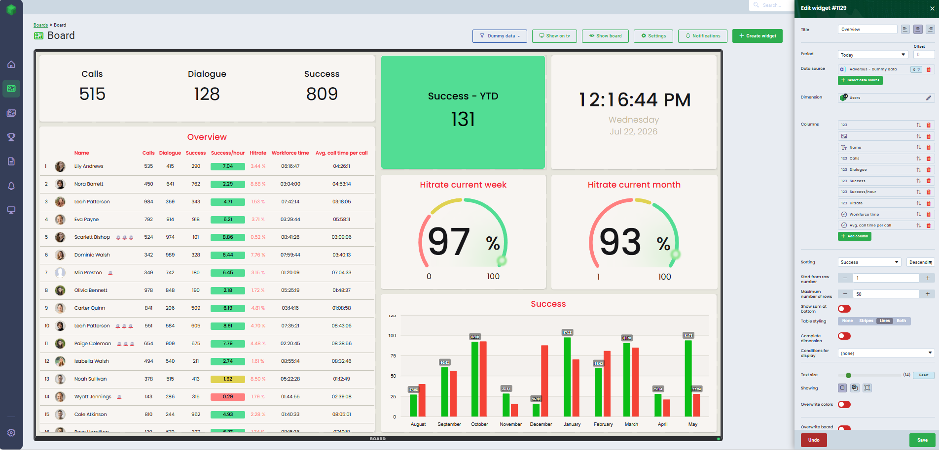
Use the table widget to display your data in columns.
- Select the Table widget
- Place the widget on the board
- Select the time period for your widget
- Leave Inherit from Board to use the board's default period, or choose another time range from the dropdown menu
- Select the data source and the dimension. Learn more about setting up a data source here.
- Use filters if you want to display specific data
- Choose the dimension on which your table will be based. You can select from users, campaigns, periods, and more.
- Click Add column for each KPI you want to display in your table.
- For each column, select a KPI and customize it with titles, abbreviations, decimals, time formatting, and choose whether to apply colors and color conditions to the text or background.
- If, for example, Users are selected as a Dimension, Users must also be selected under columns to display the users' names in the table.
- When choosing Months in Dimension and Month in column, the months will be displayed numerically (1, 2, 3, etc.). When using Month of year in Dimension and Dimension in column, the months will be displayed as text (January, February, March etc.).
- With Sorting you can sort a selected column. This allows you to, for instance, display the top performers at the top of the table.
- You can set conditions for rows, defining which rows to start and stop from.
- If you want to view more or less than 50 rows, simply input the number of rows you want under 'Maximum number of rows'.
- Show sum at the bottom - Show totals at the bottom of your table.
- Table styling - Choose between None, Stripes, Lines or Both.
- Complete dimension – Show all users, including those who have not yet contributed any data.
- Set display conditions, such as only showing rows where a column value exceeds a specific number (e.g., show only values greater than 0).
If you choose Users as a dimension and have set up Achievements, you can enable the Achievements toggle to display achievements next to the user’s name. You can read more about achievements here.
If you have an integration with Work you can display the employees skills given i Work. Learn more here.
Time is displayed in seconds by default, so remember to adjust how you want the time to be displayed in your widget.
If there are more columns than the table can display at once, you can scroll to see the remaining columns.
Watch this video for more information on the widget type Tables.
Performers
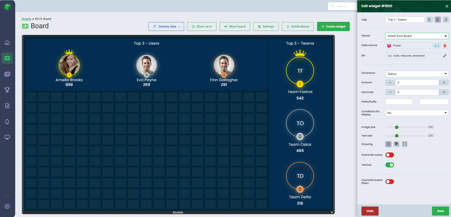
With the performer widget, you can display your top performers.
- Select the Performer widget
- Place the widget on the board
- Select the time period for your widget
- Leave Inherit from Board to use the board's default period, or choose another time range from the dropdown menu
- Select the data source. Learn more about setting up a data source here.
- Use filters if you want to display specific data
- Select the KPI
- Under Dimension, select either Users or Teams
- Select the number of performers to display, with the top 3 being shown by default. If there are more performers than space allows, you can scroll to view additional performers.
- You can add decimals, prefixes, and suffixes
- Select Yes under Conditions for display if you want to set a specific condition
- For example, you can filter the results to only include users whose KPI is above or below a specified value.
- Optionally, you can adjust both the image and text size.
- Enable Vertical to display the performer widget vertically
- Click Save
Was this article helpful?
That’s Great!
Thank you for your feedback
Sorry! We couldn't be helpful
Thank you for your feedback
Feedback sent
We appreciate your effort and will try to fix the article